Monday, April 23, 2007

On-Screen Keyboards

More and more projects are done concerning applications for PDA's, mobile phones a.s.o. Quite a lot of those include the use of a keyboard which often is a keyboard on-screen. Since I did a study (during my study Interaction Design) for Philips (Philips Media Benelux) and IPO (Institute for Perception Research, Eindhoven University of Technology) concerning the use of on-screen keyboards (or 'soft keyboards'), I feel urged to a few remarks on the subject.

1. Do not use the QWERTY-layout for the default keyboard.
Originally keyboards that came with typewriters were alphabetical. Those keyboards were mechanical devices that used a kind of small hammers (with a character on the end) to produce a character on a sheet of paper. When you typed with a certain speed, often the hammers would collide and get stuck. You had to stop then, so in the end the overall speed was not too good.

A different layout became popular (amongst the manufacturers), especially since the inventor sold his idea (the QWERTY-layout, I believe it was to Remington). In this layout, the most used letters were assigned to the weaker (slower) fingers, thus resulting in a slower speed, but effectively in a faster speed, concerning the whole proces.

Since the invention of the IBM electric ball-typewriter the need for the QWERTTY-layout has gone, but we got stuck with it, the alternative being reschooling every typist in the world.
A design that could deliver more speed than the alphabetical keyboard is the Dalton-layout.

2. Use the Alphabetical Layout as a default
Most people know the Alphabet quite well. Even experienced typists do know the alphabet better than the QWERTY-layout. They do know the QWERTY-layout, of course, but most of it is muscle-memory (That is what you use when you need money. Even if you know your code by heart, most people have to make the moves with their fingers to remember the exact code). The Alphabet was learned when you were very young, you do have a profound fuzzy knowledge of it. You know that the 'T' is near the end, while the 'F' is near the beginning, which is enough for fast 'hunt & peck'.

3. The underlying usability is more important than the keyboard-layout.
This was my main conclusion in the end. I felt I had the obligation to mention (not everybody was pleased with that, since officially it was outside the scope of my research. Well, in that case, call it a case of serendipity).
A great example of underlying usability is the search-functionality as used in OS X on Apple Computers. It is sufficient to provide the first characters and you can scroll from there.

Last but not least:
4. Let the user choose its favourite keyboard-layout
Test may show that an Alphabetical layout is faster, but that doesn't mean that it is in the perception of the user. If he/she prefers another layout (and that may very wel be because he/she perceives the QWERTY-layout to be faster), let him/her choose! It may be an emotional decision, but if it makes somebody happy, we should not prevent it.

More information
Different keyboard-layout in different languages (did you know there even is a Dutch keyboard-layout?)

Thursday, April 19, 2007

Cultural Illusions

It was not my intention to write about illusions that much, but you know teachers, they love to explain. So illusions again, simply to answer the question what I consider to be cultural illusions.
Let me show you an example:

Of course, we all see a zebra, that is not the illusion. The question is what do you perceive from a zebra? Apparently most white people see a white animal with black stripes, whihttp://www2.blogger.com/img/gl.link.gifle most black africans see a black animal with white stripes.
I guess the next picture (from the University of Bergamo) is cultural free?

By the way, in search of information about the use of post-its for user testing I found a link to an article about its use for brainstorming, but also a link to a "proper zebra-crossing":
http://hiddenchemistry.com/proper-zebra-crossings/

I am not so very sure that foregoing example is a real cultural illusion, but the next is. Look at these stairs:

Again, the illusion is not whether these are stairs or not, but how do you perceive them. Are they going up? Or are they going down?
Apparently most Europeans and Americans perceive these stairs as 'going up', while people from countries where the direction for reading is from right to left look upon these stairs as going down.

It makes me wonder if the same goes for the next stairs:

Are these stairs going up or going down? Based upon what?

Let me finish with the most interesting stairs, several illusions appear together here:

If you want to know more about it, read the accompanying article: http://www.quantonics.com/Stairs_As_Perceived_by_Our_Quantum_Stages.html

Saturday, April 14, 2007

Tunnel-vision

Tunnel-vision is a proces where clues seem to lead us in a certain direction, whereafter following information seems to justify our presumption.
The first time I heard about it, was concerning an investigation by the police, where the investigating officers jumped to a conclusion in the first stages of an ongoing investigation. Thereupon all clues that conflicted with their conclusion were ignored (to be "of no importance" of "inconclusive") while clues that reinforced their idea were accentuated.
And yes, an innocent men was sent to prison for over 10 years....
Recently I came across the same problem with two students working on their final project. In an early stage they had a good brainwave, got a good idea (and the idea still is), but in the following research they just looked at facts that supported their initial design, while ignoring conflicting facts. And that is just no the right way a research should be executed. (And right so, because in their subsequent research they did find reasons to alter their original design, so came up with a better product in the end!)
And now we, apparently we fall for the same trap. Consider the following pictures:


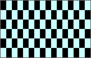
Do you see any parallel lines? In the upper picture it is evident, but what about the lower? No? Neither do I. Nevertheless the horizontal line are parallel, although you can't see so. (Don't believe me, check!)

This was first discovered during the redecoration of a pub in Bristol, the owner decided that he like black and white tile alternating on the outside of his pub. The tiles were to be set in stretching bond (each tile is placed with its center on top of the border between two tiles). When the decoration was finished, it didn't please the owner, of course, it was not what he intended. Nowadays the pub is famous all over the world because of its outside tiles.

For an explanation of the effect, read the article from Bristol.

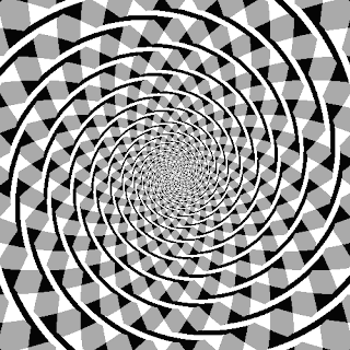
Speaking of a tunnel


When you see the spirals, you realise that you can go deeper and deeper. Unfortunately you jumped to the conclusion that it are spirals that you see. I suggest you follow the cirkels with your finger to be absolutely sure. There really is no tunnel to go into. But at least now you know why it is called tunnel-vision!.

Illusions - I

Perception seems to be a key-item for me. When our mind plays tricks with us, we call that illusion. Several types of illusions do exist. We may encounter verbal illusions, visual illusions, cultural illusions (hmm, aren't they all, maybe I should look into that) a.s.o.

Illusions are as old as mankind. Wellknown examples as "Trompe d'oeil" (yes, there should be a link here, hmm, maybe when I find more time. For now just google yourself).


Very intriguing is what is called the "Hollow Face - illusion", several examples exist, which I will lead you to. Look at the accompanying picture, the little paper dragon. When you do not know what is the matter, you don't see anything unusual. Let's illustrate this with two movies:

1. The Hollow Face - illusion, face of Richard Gregory.

2. Charlie Chaplin - Hollow Face - illusion

This is all about assumption & perception. We know what we see, but our minds are unwilling to accept what it is that we see, so they create our own reality, and we are most happy with it. Try to stay happy when you look out your window and realise this is what we do every day.

For years I was very interested in virtual reality, only to find out, that reality already was quite virtual as it is. The same goes for 3-D objects. Some of us spend a lot of time creating them (not me, I'm just too lazy, although I did try some ray-tracing, years & years back). And always they are trying to create a type of reality that just waits to be rebuild in our heads.

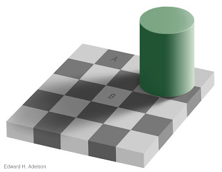
Consider the next picture, especially tiles 'A' and 'B':


Myself, I was very intrigued by the fact that both surfaces have the same color. I mean, you don't SEE the same color! There are several ways to prove that they indeed have the same color. Use a colorpicker to check on the colors (I didn't want to believe it, so I did), or better view the movie:
http://web.mit.edu/persci/gaz/gaz-teaching/flash/plaid-movie.swf

Here, again, it is our assumption that creates the illusion, our minds 'enhance' the effect, by trying to create the picture that would be responsible for what we actually see. If those tiles look the same, than they should be a different color, because the upper one is in the light, while the lower surface is in the dark. If they're the same, they must be different!

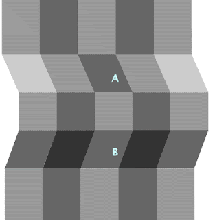
We will encounter more of this in the future, because our minds keep on tricking us for all the right reasons, but in all different kind of ways. For now I leave you with the next example, where 'A' and 'B' again have the same color.

(so, for people who think I am quite grey: are you sure it's not just only in your mind?):-)

More from Richard Gregory:
http://www.richardgregory.org/experiments/index.htm

Want to make your own little dragon?
http://www.grand-illusions.com/opticalillusions/dragon_illusion/
http://www.pontomidia.com.br/ricardo/greatweb/gathering_for_gardner_paper_dragon.html
Not just dragons, a skeleton too:
http://ravensblight.com/Illusion.html

Wednesday, April 11, 2007

Perception

Perception again, yes. Like I said, I think it is an interesting subject. Consider the following item:
We have four frigidaires, all of them are white.
Now answer the following questions:
What is the colour of the first frigidaire? ...
Yes, that is correct.
What is the colour of the second frigidaire? ...
Indeed, that is correct again.
Now can you tell me the colour of the third frigidaire? ...
Well, correct again. We're nearly there.
Tell me, what is the colour of the fourth frigidaire? ...
Correct, that was easy.
Now tell me, what does a cow drink? ...

Okay, if you say so....

I am not sure as how this works written as well, but if it didn't then try it with somebody. Just ask the questions, wait for the answer, then ask the next question.
This is an example of "priming".

Another example, answer the next questions:
"May a woman marry the friend of her daughter?" ... "May a man marry the mother of his sister?" ... "May a man marry the sister of his widow?" ...
Guesses are that about eighty percent of the people will say 'yes' to the last question. The right answer, of course, should be 'no'.
(If you don't see it, ask yourself: what does 'widow' say about him?).

It is interesting to see what goes wrong here. Apparently our minds get set on a track and then it is difficult to change. It illustrates that we only use a part of the information that we get.
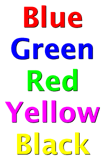
But even if we only use a part of all the available information things can go wrong. Read the following words:

That was not too hard, was it? Just a few names of colors. Piece of cake.
Now look again, but now do not read the names, but name the colors you actually see, the colors of the words.
Maybe still a piece of cake, but quite a different cake, is it not? It should not be too hard, but it is.

This is an example of conflicting information. It should not be any problem if the words were f.e. Icelandic, or in Japanese characters (unless you were from Iceland, resp. Japan, of course). Young children who still have to learn to read, but already know their colors do not see any problem.
We get two sets of information: (1) the color and (2) the text. When those two match there is no problem, but when they don't...
This effect is called "the Stroop-effect", named after Dr. John Ridley Stroop who did describe the effect first in 1935.

Want to try some more 'stroop'?
go http://www.dcity.org/braingames/stroop/
When you like those braingames, have a good intuition, and an understanding of statistics I suggest to play the "3-doors game".

More about priming?
Priming: Priming is an acuteness to stimuli because of exposure to a certain event or experience. For example, an individual who has just purchased a new car may now start to notice with more frequency other people driving her same make and model. This person has been primed to recognize more readily a car like hers because of the experience she has driving and owning one.(http://www.alleydog.com/glossary/definition.cfm?term=Priming)
wikipedia
the priming theory
Want to try an experiment?

Tuesday, April 10, 2007

Groningen University Museum

One of my main interests always is perception. We do not see what's there, we see what we see, we percieve. That is true for images (I will write about that soon), but it is also true for text. Look at the following question:
"How many animals of each type did Moses take with him in the arc?"

Usually the answer will be "2 animals of each kind". Apart from problems of biological nature (male & female doesn't count for snails a.o.), the answer should be "none".
None? Yes, because it was not Moses but Noach, that built the arc.....
And no, this is not just a joke I hope you fell for, it is an illustration of the way our mind works. A problem does not have to be complete, there may be some mistake in the information, it is not a problem for us, as illustrated before. We, people, are very good in fuzzy information.
Take a look at the following picture.

You probably recognize the sentence, it is used to introduce you to a new font. It is used because it contains all the letters in the alphabet. Why I did put it here?
Well, did you notice anything wrong? Maybe you did, but you probably did not.
Read the sentence. Say the sentence. Say the sentence again, now without looking at the picture. Still without looking at it, count the number of words in the sentence.
Now look at the picture and count the words again. Notice anything strange?

This is what our mind does. It perceives. It perceives what it thinks is meant, and all 'ballast' is filtered out. More examples are available at the "Groninger Universiteitsmuseum". When you are in (or near) Groningen, I recommend a visit. It is almost free, it is very interesting (it helps if you understand Dutch), and it is Oude Kijk in 't Jatstraat 7a.

UNIVERSITEITSMUSEUM
Oude Kijk in 't Jatstraat 7a
9712 EA Groningen
tel. 050-3635083/3635562
Tuesday to sunday, 13.00 - 17.00
until May 13

Groninger Universiteitsmuseum
Bent u een goed verstaander?

Friday, April 6, 2007

User Testing - II

Cheap and Easy again! This time: Paper Prototyping. Again it is most useful when done in the early stages of development. It may be used for the whole design or just for parts of it, or both.
The most important rule: Don't make it look nice!
Usually this is very difficult when you are a graphic designer by heart, but it is so important to get results that make sense. When you just sketch with a felt-tip then you make it your speaking partner (one of the real end-users) much easier to help, suggest, or sketch with you. When you cook up a shiny design-proposition, it will look much more ready for an end-user, and you will only get feedback on details. The distance between buttons, the amount of shine on a bevel, and so on:
You always get feedback on the level of detail you provide a user with.

I used to make sketches in Flash (and yes, they were just sketches), but I learned that I got so much more basic information when I took just some paper, some felt-tips, a pair of scissors and some stickies (yes I am Dutch but I do mean those yellow attachable papers). When you make a rough sketch you get basic information, when you make a detailed sketch you get detailed information (but not the basix!), when you make a glossy sketch you just get glossy information.

More information:
Usability net about Prototyping
Shawn Medero's article on paper prototyping, very useful!
Dutch movie on how to use paper prototyping. Thank you, Ruben!
5 tips, including the "incredibly intelligent mouse"

Remark: I just found out, although I call those yellow attachable papers stickies, they're actually called Post-it. thank you Alda.

Read Kathy Sierra's article "Don't make the Demo look Done", where this picture is from.

Don't Believe the Hype: The 21 Biggest Technology Flops

Go "Don't Believe the Hype: The 21 Biggest Technology Flops
Sometimes just too early (Apple's Newton), sometimes too late, sometimes just plain stupid (Irridium, Bob). But will we learn from it?
What will we learn from it?
Anyway, read it, and if you want to, vote for one

Tuesday, April 3, 2007

Usability vs Experience

Usually people look upon me as a usability-enthusiast, an evangelist even. To be honest, I was. In fact I still am, but only so far. When I started as an Interaction Designer my focus was on making it easy for users to use products, make it understandable, make things transparent. Important was to use the right labels, the way the information should be constructed, aso. The reason that I started my study Interaction Design was that I always had the feeling that "things weren't right", "it should be possible to make to make things better". Then I stumbled upon Psychology of Everyday Things by Donald A. Norman. And suddenly I understood: "Wow, things can be done! You just have to design them in a better way". So I took up Interaction Design, concentrating on cognitive ergonomics, usability.

But I always had the feeling there was something more. I couldn't exactly put my finger on it, but the feeling was that I seemed to miss something. Again it was Don Norman, he then published Emotional Design. And again things fell in place. After that I discovered Train of Thoughts, by John Lenker.
So I finally grew up and understood why people used SMS, despite of its horrible interface (instead of typing 10 numbers and speaking what they had to say, people punched 10 numbers and kept punching to get the message across). Like I understood before about games, games have to be exciting, it does not matter if they look good (ouch!), it's just the box that it is sold in has to look good. And the same goes for websites, people don't visits a site because it looks good, but because they find the needed information there, preferably fast. And I could go on this way.

Since I live in the Netherlands, and we are a cycling country, just one more example I used in my classes. When you cycle from home to school (or your office or whatever) each morning and you have a choice between two routes, one along the highway straight on for several miles, the other on the other side of the same highway but it meanders along a stream, leads you through a few trees, but also is a mile longer. When you're in a hurry, you will take the fastest route. But when people have the time, a majority will choose the longer route, just because it is more appealing, more pleasant to use.
Indeed, just so much for functionality, for usability. That's only a part of our lives.